With the removal of TapaTalk, people are now going to need to access the site on their mobiles using their browser.
The nice feature of this site is that is has a fully responsive theme, which automatically scales and hides certain certain aspects of the theme depending on the resolution of your browser.
Header and Navigation
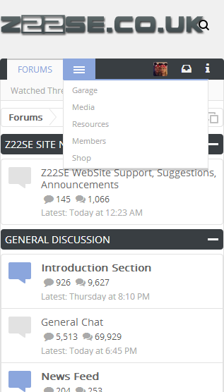
Depending on where you are on the site, the top Navigation will display the current location. All the other locations are then hidden inside the 3 lines. Tap that area to expose the drop down, and click the desired navigation link.
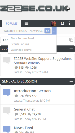
The seconds section of the top header is the action links for the section you are in. This scales in the same manner, leaving the Watched Threads and New Posts links visible, with the rest hidden. Access to the other ones is the same as previously mentioned.
Browsing the site
Browsing the same is the same as the regular desktop theme, but again, with certain aspects hidden or moved about slightly.
Take the New Posts link for example. Clicking on that takes you to your list of Unread posts
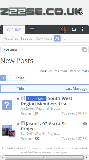
Again, nothing new, just a few items removed which aren't required.
Thread View
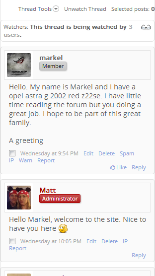
The main thing you will notice is the layout of the Thread View. This moves the avatar and poster information above the post, rather than it being on the side.
Replying to the posts is exactly the same, as the reply box scales
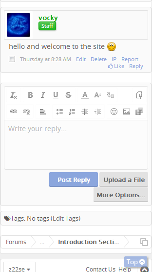
Posting a new thread is also the same as the main desktop site, with all the same options available.....just scaled down.
The nice feature of this site is that is has a fully responsive theme, which automatically scales and hides certain certain aspects of the theme depending on the resolution of your browser.
Header and Navigation
Depending on where you are on the site, the top Navigation will display the current location. All the other locations are then hidden inside the 3 lines. Tap that area to expose the drop down, and click the desired navigation link.
The seconds section of the top header is the action links for the section you are in. This scales in the same manner, leaving the Watched Threads and New Posts links visible, with the rest hidden. Access to the other ones is the same as previously mentioned.
Browsing the site
Browsing the same is the same as the regular desktop theme, but again, with certain aspects hidden or moved about slightly.
Take the New Posts link for example. Clicking on that takes you to your list of Unread posts
Again, nothing new, just a few items removed which aren't required.
Thread View
The main thing you will notice is the layout of the Thread View. This moves the avatar and poster information above the post, rather than it being on the side.
Replying to the posts is exactly the same, as the reply box scales
Posting a new thread is also the same as the main desktop site, with all the same options available.....just scaled down.
